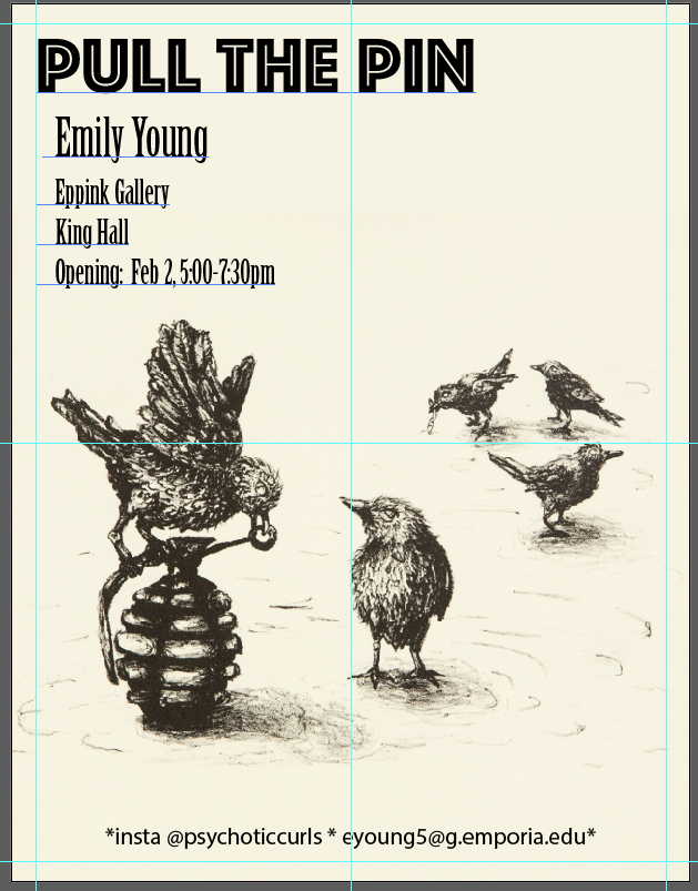
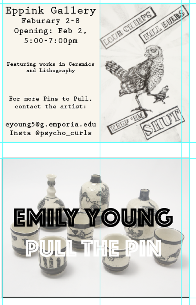
  This project was interesting for me because i have never done anything design related for an actual commercial purpose before. I had a very hard time being able to tell if things really looked as nice as I thought they did. Some of the biggest critiques I got was on the text font unity between the poster and postcard (use the same font next time), on the color of the postcard title (the white didn't show up as well once it was printed and it was hard to read), and on the proximity of the text on the back of the postcard to the edges- they would likely get cut off.
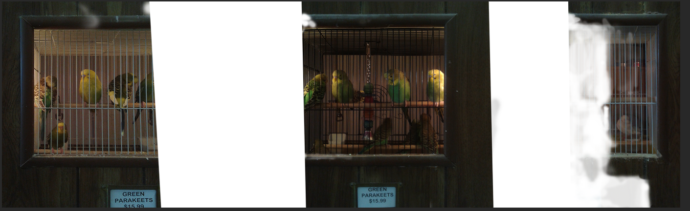 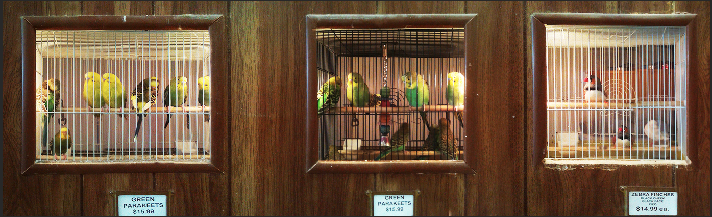  I loved making the concept for this project- me being in the cage with the parakeets because I love birds. However, the stitching together the photos for the scene at the beginning was terrible and very difficult. That part of this project took up most of my work time.
|
AuthorI am a ceramic artist who is taking this class because I have to and am totes my goats not ready for computer stuff. Archives
December 2017
Categories |
 RSS Feed
